Since some people are asking, I thought I'd share some behind the scenes of making the Cryo album artwork. I collaborated with two talented artists to put it together.
First is my initial sketch. I knew I wanted something cryogenic because there were some icey hibernation themes on the album, plus what's more chill than being frozen for eternity? Also, I had in mind a futurist take on Bowie's Aladdin Sane.
I made a mood board of textures and colors, which I normally do for any visual-based project.
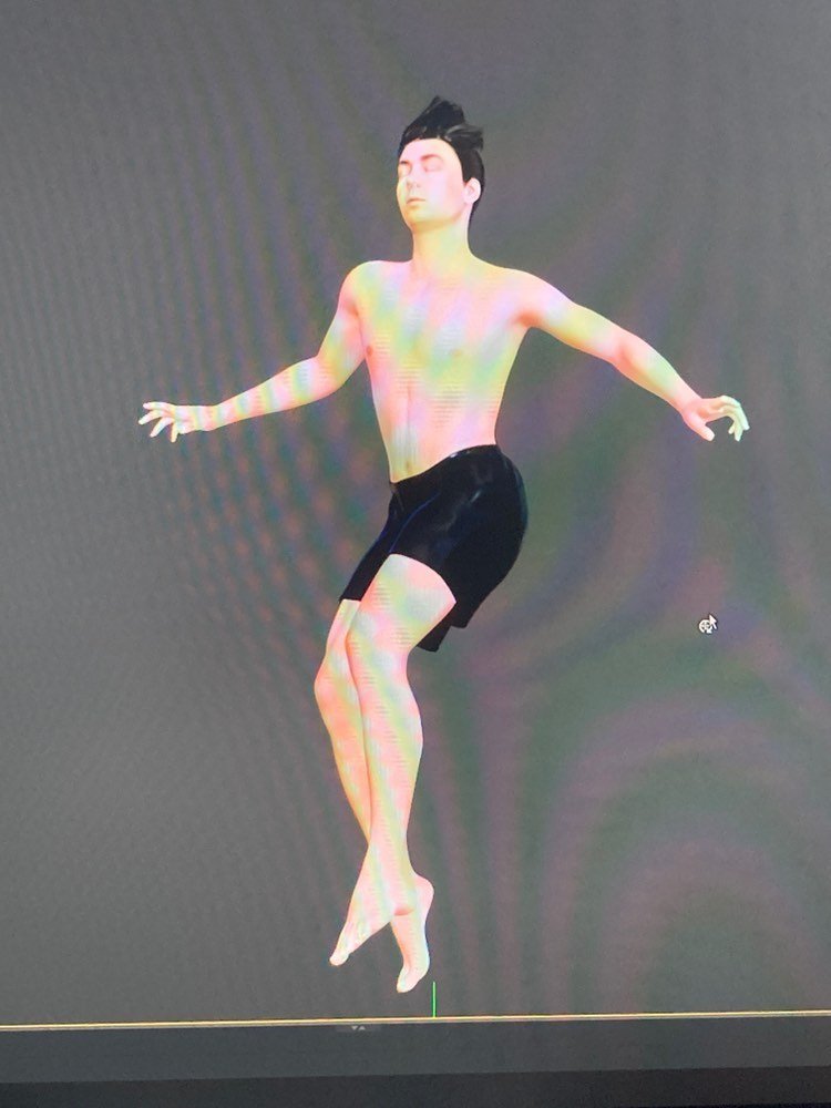
Then I commissioned Owen Blodgett - @primary_orifice - to make a 3D render of my head. This grants more control for lighting and meant we could reuse it on the back cover. To help Owen make the model, I took pictures of my face from many different angles. He then compiled these to generate a 3D representation of my head and upper torso.
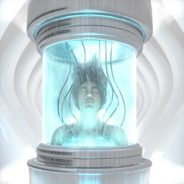
We also added the wavy hair, as if I'm on a deep space mission in zero gravity. You may have to cryosleep for thousands of years in a spaceship before you land on that exoplanet, ya know? (Now I think it sort of looks like a troll doll lol).
Owen threw me in my cry chamber, and after a few design iterations and more mist in the foreground, we landed on what you see here. I chose a more simpler version, though we had some other drafts that were cool too.
Decided not to add text because who cares nowadays? The album name and artist name are going to show up on your streaming device anyways, so it doesn't matter to me.
Final album artwork for Cryo
For the back cover of Cryo I looped in Jordan Rundle. Making this was a bit simpler since we already had the head model.
First off, I made a sketch for this one too. My idea was to include a larger scene that displayed the cryogenic tank and some other life support systems and server-looking computer systems. I also thought it'd be tight to include the tracklisting on a screen.
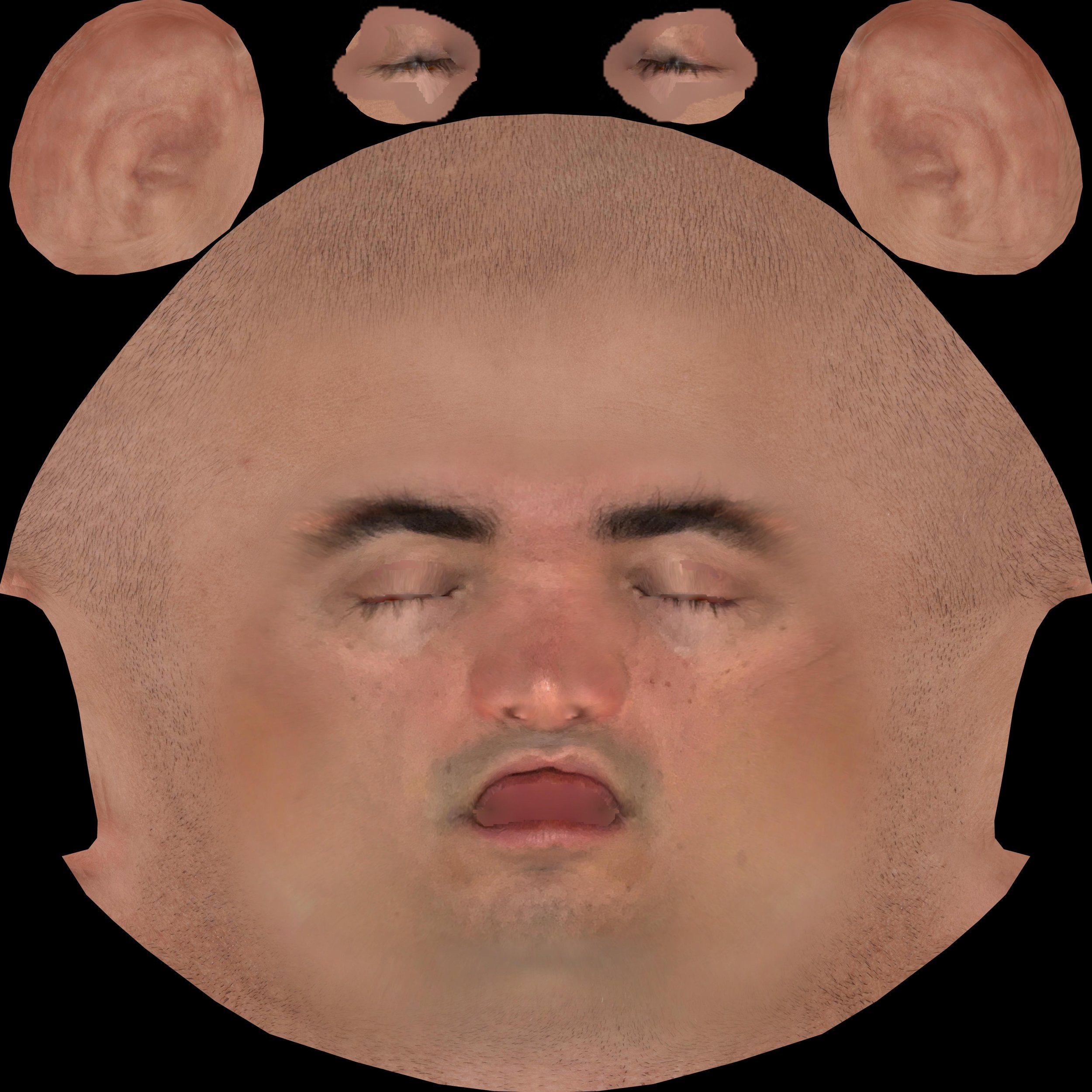
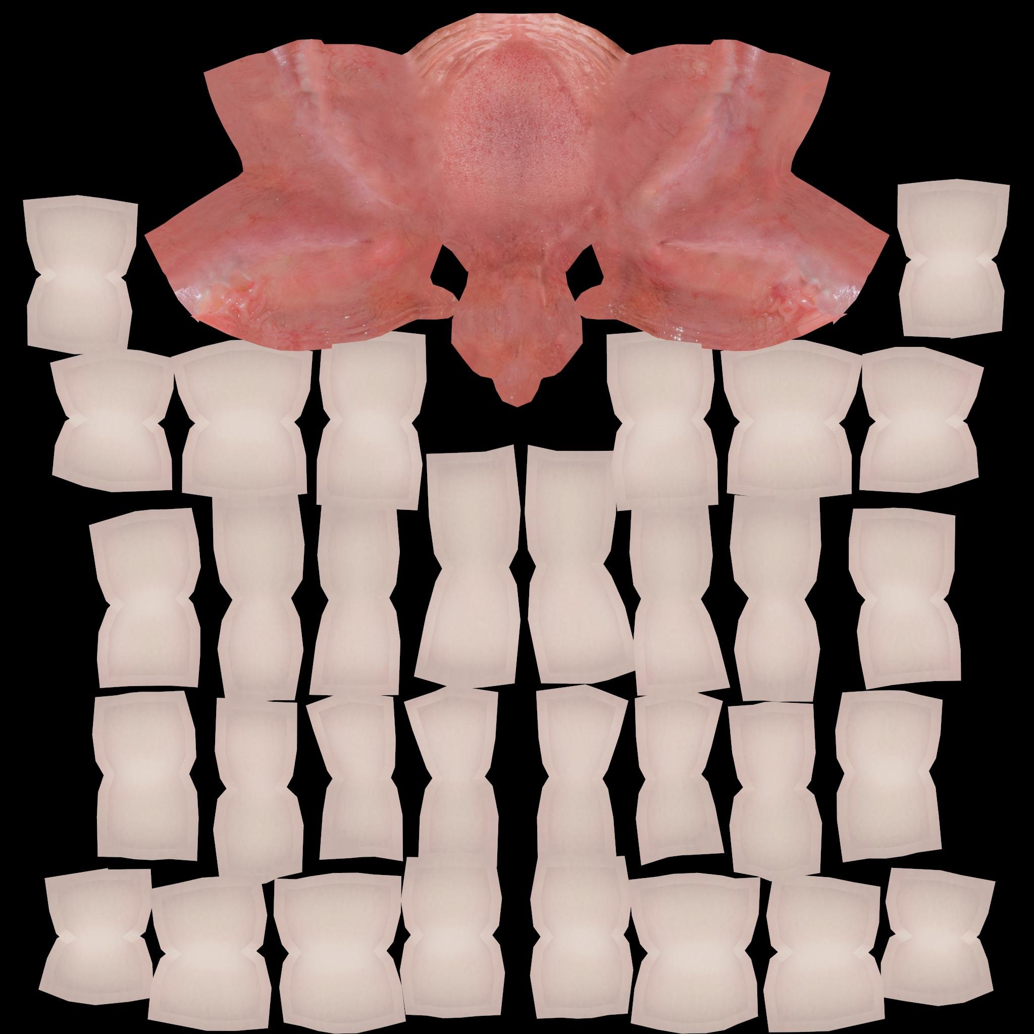
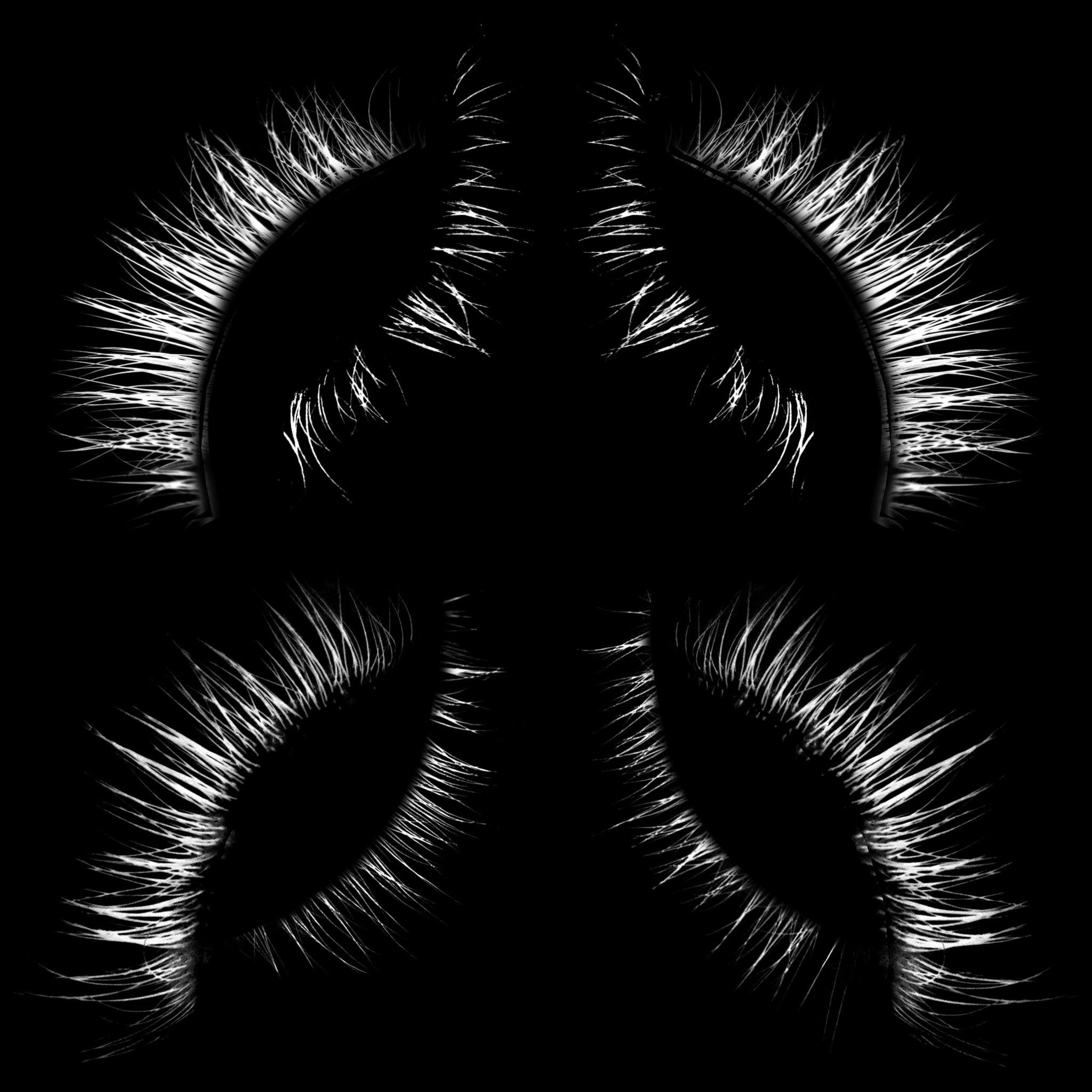
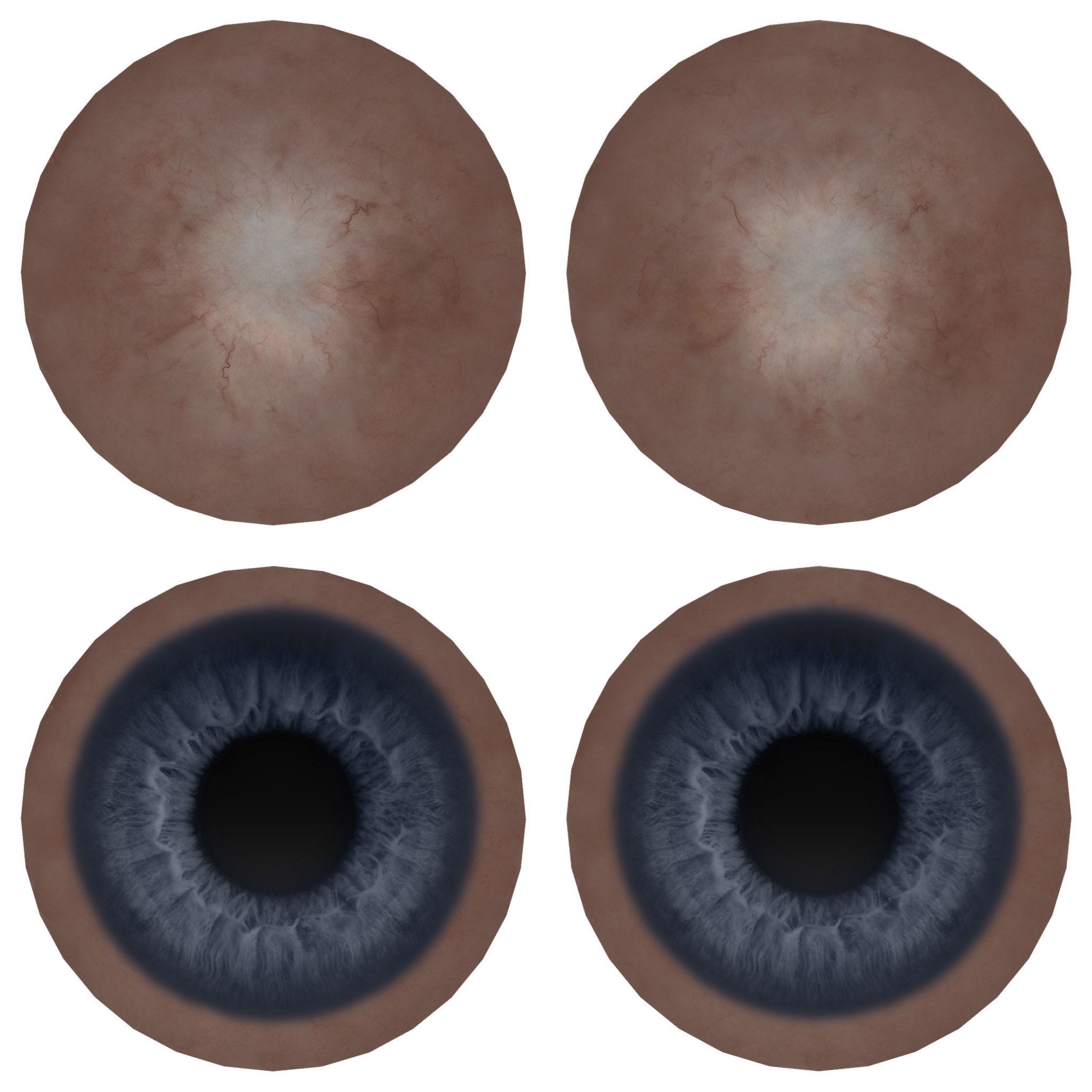
When we were done with the front cover, Owen bounced out an FBX file of the 3D head/torso model for Jordan to use in his design. When you export these sort of things you pass along these texture maps, which are pretty grotesque looking when spread out flat, hah!
So, Jordan essentially took this model and inserted it into the scene he made. I love how some panels reflect the light from other areas — cool attention to detail.
Final back cover for Cryo
It was really cool working with two artists on this, and I'm so glad both were down to collaborate in this way. I loved seeing their unique takes on a similar concept.
